


7. Adding Look and Feel with Resources
Any application written for the Windows environment needs an interface to the user that gives it the "look and feel" of a Windows application. Various standard mechanisms are available to create this look and feel, and resources are some of the most important of these. Resources such as menus and dialog boxes define the interface to an application.ResourceStudio contains tools for creating and modifying the resources. This chapter defines the different types of resources and explains how to use ResourceStudio to create three basic resources: menus, dialog boxes, and bitmaps. The final section describes how to work with the identifiers by which resources are referenced in the source code.
For more information about ResourceStudio, see ResourceStudio Resource Editor. For more information on resources and programming with resources, refer to the following texts:
- Programming Windows 3.1 by Charles Petzold
- Microsoft Windows Programmer's Reference, Volume 4: Resources
What Are Resources?
Resources are structured data objects that define Windows user interface elements. When you choose a command from a menu or select options from a dialog box, for example, you are interacting with an application's resources. Predefined resource types include bitmaps, cursors, icons, fonts, dialog boxes, menus, accelerators, strings, and version information.An application's resources typically are defined in a resource script file (.rc). Each resource definition contains information and data relevant to that resource type, as well as the identifier by which the resource is referenced in the source code. Resource script files are created and edited with ResourceStudio.
Resources are compiled by a special resource compiler and are linked to the Windows application separately from the application code. This modular design enables you to modify the appearance of an application without changing, or even accessing, the program source code. Separating resources from code also makes it easier to use the same resource definitions for multiple applications.
Resource Types
Create and edit the following resource types in ResourceStudio:Bitmaps
Bitmaps are used by an application to display pictures on the screen. Each bit, or group of bits, in a bitmap represents one pixel of the image. Bitmaps may be any size you specify.Cursors
Cursors are small bitmaps, usually 32 x 32 pixels in size, that represent the mouse pointer. Cursor images may contain areas that are transparent, allowing the screen background to show through unused parts of the cursor image. Cursors also may contain inverted areas in which the screen background color is reversed.In addition to image information, a cursor resource also specifies the cursor's hot spot, the exact pixel in the image that maps to the mouse pointer's screen location.
Icons
Icons are small bitmaps, usually 32 x 32 or 16 x 32 pixels in size, that represent applications or actions within an application. For example, when you minimize a Windows application, an icon is displayed on the screen to represent the minimized program. Like cursors, icons may contain transparent and inverted areas.Fonts
A font resource is a collection of up to 256 bitmaps of identical height. A font typically represents a character set, but it also may be used for more efficient management of bitmaps not representing characters.Dialog boxes
Dialog boxes are windows that communicate information and receive user input. For example, a dialog box may let the user set program options, or alert the user to an error and ask how to proceed. To enter information and make selections in a dialog box, a user manipulates graphical elements called controls. Commonly used controls include buttons, check boxes, listboxes, textboxes, and scroll bars.A dialog box resource is a complex set of data describing each control in detail, as well as general properties such as the dialog box size and location.
Menus
Menus are hierarchical lists of program commands and options. When a user chooses an item from a menu, either an action is taken or another menu opens to provide additional commands. A menu resource identifies the available commands, specifies their individual styles and attributes, and determines the order in which they appear.Accelerators
Accelerators are key combinations a user presses to perform a task in an application and are frequently used as shortcuts to menu choices. An accelerator resource contains a collection of key combinations and associated commands.Strings
Strings are text that an application may use in window titles, menus, dialog boxes, error messages, and so on. A string resource is a table of strings.Version information
The Version Information resource contains version information for Windows .exe and .dll files, such as version number, file description, company name, and copyrights.User-defined resources
User-defined resources contain data that you define and use in your program in any manner you choose. For example, you may want to attach a table of data or a block of text to your executable file. ResourceStudio allows you to include these types of data in your application's resources and to edit the data in hexadecimal format.Using ResourceStudio
ResourceStudio can be used to:- Create new resources in script or binary form
- Edit resources, even those already linked to an executable or DLL
- Copy resources between files
Starting ResourceStudio
Start ResourceStudio using any one of several commands available in the IDDE's Resource menu:- Edit
- opens the current project's resource (.rc) file for editing.
- New
- opens the current project's resource file. A dialog box then opens, allowing you to create a new resource.
- Open
- opens a dialog box from which you can select for editing any file that contains resources.
- Settings
- opens ResourceStudio to the Settings dialog box, but does not load any resource file.
To create a new resource file, choose Open from the Resource menu, and in the File Open dialog box click Cancel. Then, double-click on the ResourceStudio icon on the desktop. The Resource Studio Shell window opens (Figure 7-1).
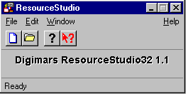
Figure 7-1 Resource Studio Shell window
The Shell window is ResourceStudio's main window and contains the main menu and toolbar. From this window, you can create and open resource files and set ResourceStudio preferences.
Another window that will open as you work is the Property Sheet. The Property Sheet does not open immediately, but rather opens when it is first needed. While creating and editing resources, you can use the Property Sheet to view and edit properties of the currently selected object. (In this context, "object" refers to either a resource as a whole or to an element within a resource, such as a dialog box control or a menu item.) Some types of objects have multiple pages of properties; to switch between pages, simply click on the tabs.
Creating a new resource file
Resources are contained in resource files. Use ResourceStudio to create and edit most types of files that store Windows resources. For example, you can edit the resources of executable files even if you do not have the original source code.
To create a new resource file, choose New from the File menu. The New File dialog box opens (Figure 7-2), listing the types of resource files that can be created with ResourceStudio. | 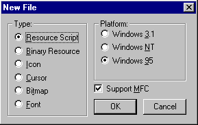 Figure 7-2 New File dialog box |
Select the type of resource file you want to create (see Table 7-1). Note that resource script (.rc) and binary resource (.res) files usually contain more than one resource. If you are starting to create resources for a new application, .rc is likely to be your choice of file type. Resource scripts can contain any type of resource.
| File Type | Extension | Contains |
|---|---|---|
| Resource script | .rc | Any type or combination of resources in text format |
| Binary resource | .res | Any type or combination of resources in binary format |
| Icon | .ico | A single icon resource in binary format |
| Cursor | .cur | A single cursor resource in binary format |
| Bitmap | .bmp | A single bitmap resource in binary format |
| Font | .fnt | A single font resource in binary format |
Resources such as icons can be contained either in individual icon resource files (.ico) or with other resources in a resource script file. Some resources, such as dialog boxes and menus, are contained only in .rc or .res files. Thus, these resource options do not appear separately in the New File dialog box.
The Platform option in the New File dialog box lets you create resource files that are compatible with Windows 3.1, Windows NT, or Windows 95. You can also elect to create resources for an MFC application by checking Support MFC.Warning: If dialog boxes for NT come out with a white background, select Windows 95 as the target platform. This is because the Windows NT target is for NT 3.51, an old version.
After selecting a type of resource file, click OK. The window that opens next depends on the type of file you specified. If you selected one of the file types containing a single resource (icon, cursor, bitmap, or font), that resource type's editor opens in a separate window.
If you selected Resource Script or Binary Resource, the Browser window opens (Figure 7-3).
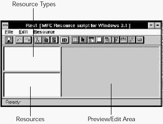
Figure 7-3 Browser window
The Browser window has three main areas:
- Resource Types:
- A listbox containing all the resource types found in the current file.
- Resources:
- A listbox containing resources of the currently selected type.
- Preview/Edit:
- A display of the selected resource. Resources also are opened for editing in this area when created, or by choosing Edit Resource from the File menu.
Note: ResourceStudio has several subprograms, each of which is used to edit a particular resource type. In this chapter, for example, you will use the Menu editor, Dialog box editor, and Bitmap editor. Each individual resource editor can either be opened in a separate window or can use the right pane of the Browser window from which it is launched. The latter is the default behavior in most circumstances.
Editing a resource file
Besides the resource files listed in the previous section, you can edit the resources of executable files, even though you don't have the original source code. By choosing Open from the Shell window's File menu, you can open files of any type listed in Table 7-1, plus files of the following types:- Windows executable (.exe): Bound resources of any type
- Dynamic-link library (.dll): Bound resources of any type
Creating a new menu resource
The main interface between the user and a Windows application is generally the application's menu. The IDDE's Resource menu is a good example, as shown in Figure 7-4.
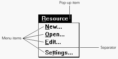
Figure 7-4 A typical menu
A menu is a hierarchical structure containing pop-up items, menu items, and separators.
- Pop-up items open a drop-down menu box containing menu items and additional pop-ups. The top-level items that are displayed on the window's menu bar are usually pop-up items. A pop-up item can be thought of as a container for other items (including other pop-ups).
- Menu items usually constitute the majority of items in drop-down menus. When a menu item is chosen, Windows sends a message containing the item's command identifier to the application.
- Separators are lines that divide the menu into logical groups.
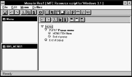
Figure 7-5 Menu editor open in Browser window
Note: While a resource editor is open in the Browser window, the Browser window's menu is replaced by that of the particular resource editor. The editor's toolbar is displayed at the top of the right pane, below the Browser window's toolbar.
The new menu resource initially contains a single pop-up item and a menu item. The list of items is indented to show the hierarchy. Pop-up items are labeled POPUP, menu items are labeled MENUITEM, and separators are labeled SEPARATOR. The currently selected item is enclosed in a box; to select any item, click on it. The Property Sheet shows properties of the selected item.
The Test menu window (Figure 7-6) opens at the same time. You can test the menu in progress at any time in this window.
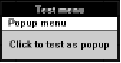
Figure 7-6 Test menu window
Adding a pop-up item
Start creating a menu by adding a new pop-up item to the menu bar. To do so, click on Menu at the head of the item list. Then choose New Popup from the Menu menu. The new pop-up item is inserted at the start of the list.The Property Sheet displays the properties of the new pop-up item (Figure 7-7). At this point, you probably want to change only the menu name, which is contained in the Text field.
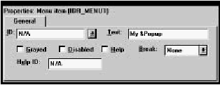
Figure 7-7 Properties of a Pop-up menu
When changing the menu name, you can also assign an activation key to the menu. Put an ampersand (&) in front of the corresponding letter in the text.
Adding a menu item
To add one or more menu items to a drop-down menu, first make sure that the pop-up item is selected. Then choose New Item from the Menu menu. The new menu item is inserted into the hierarchy.The Property Sheet displays the properties of the new menu item (Figure 7-8). You can change the item's text and add an activation key. As with pop-up items, you add an activation key by typing an ampersand (&) in front of the corresponding letter in the text.
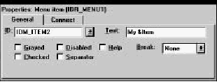
Figure 7-8 Properties of a menu Item
The ID field contains the command ID, which is sent to the application when the user chooses this menu item. New command and resource IDs are assigned automatically to new objects when they are created; you can also change ID names and numerical values as desired. For more information on resource IDs, see the section "Managing Resource IDs" later in this chapter.
Adding separators
Separators enhance the readability of menus. To insert a separator after the currently selected item, choose New Separator from the Menu menu.Editing menus
The normal editing operations (cut, copy, paste, and delete) work with items in a menu. Note that when you perform one of these operations on a pop-up item, all of the items it contains are affected as well.Rearrange menu items quickly by clicking and dragging. To move an item, drag the item to the location where it should be inserted. If you hold down the Control key while dragging, a copy of the selected item is inserted. The copy is given a new, unique resource ID.
You can also rearrange menus with the arrow keys. To move an item up or down within its present level in the hierarchy, press Ctrl+Up Arrow or Ctrl+Down Arrow. To move an item horizontally, use Ctrl+Right Arrow or the Ctrl+Left Arrow.
Closing the menu editor
After you have arranged your new menu, close the Menu editor by choosing Close Editing from the File menu. The Browser window is updated to show the new resource (Figure 7-9).
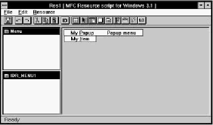
Figure 7-9 Browser window after creating menu resource
The Resource Types list contains an entry called Menu to show that you have at least one menu resource. The Resources list contains the ID of your menu resource. The Preview/ Edit area shows a preview of the new menu.
The Property Sheet displays the menu resource's ID and memory options (Figure 7-10).
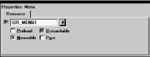
Figure 7-10 Properties of a menu resource
To edit a menu resource, double-click on its ID in the Resource list, or select the resource and choose Edit Resource or Edit in Separate Window from the File menu.
Creating menus with accelerators and item help
As you create menus, you usually want to assign accelerator key combinations and item help strings at the same time. To do so, you must set up the string and accelerator tables before adding menu items, as outlined here:- Create a string table resource by choosing New String Table from the Browser window's Resource menu.
- Close the String Table editor by choosing Close Editing from the File menu.
- Create a new accelerator table resource by choosing New Accelerator Table from the Browser window's Resource menu.
- Close the Accelerator Table editor by choosing Close Editing from the File menu. Note the accelerator table's resource ID.
- Create a new menu resource by choosing New Menu from the Browser window's Resource menu.
- Make the new menu's resource ID the same as that of the accelerator table resource. In the Property Sheet, select the accelerator table resource's ID from the drop-down list in the ID field. You now can add menu items with accelerators and item help.
To show which key combination is associated with each menu item, add the accelerator to the item text. For readability, the accelerator is usually separated from the command name with a tab. For example, if you want Ctrl+F to be the accelerator for a command called Find, enter Find\tCtrl+F into the Text field of the menu item's Property Sheet (Figure 7-11).
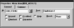
Figure 7-11 Menu item text
Simple guidelines for creating menus
When creating a menu, keep in mind the following points:- Place frequently chosen options near the top of the menu to make them more accessible to the user.
- Group related options under specific menu titles.
- Follow standard conventions to make the application easier to use.
Creating a new dialog resource
A dialog box is a window that communicates information and receives user input. It contains graphical elements called "controls." Figure 7-12 shows a typical dialog box.
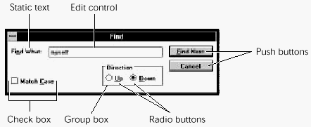
Figure 7-12 A typical dialog box
The following types of controls can be included in your dialog boxes:
- Push buttons send command codes to your application when the user clicks on them. They trigger an immediate action.
- Check boxes are rectangular buttons that turn options on or off. Text describing the option is displayed to the left or right.
- Radio buttons provide a set of options, only one of which may be selected. They are generally arranged in logical groups of two or more.
- Edit controls (or textboxes) are rectangular boxes used for text entry.
- Listboxes contain a list of items, usually in text form. The user can browse through the list and select one or more items.
- Comboboxes combine the features of an edit control and a listbox; they let the user select an item from a list or type a selection into the textbox.
- Scroll bars let the user specify a numerical option with an analog control. (Edit controls and listboxes have their own scroll bars and do not need a stand-alone scroll bar.)
- Group boxes are rectangular frames with an optional caption, used to group other controls together visually.
- Static text is used to convey information or to label controls that do not have captions (such as edit controls).
- Pictures are used for decorative purposes. Picture types include empty frames, solid boxes, and icons.
- Custom controls are user-defined controls implemented in a DLL.
- User controls are user-defined controls that are not implemented in DLLs, or whose implementation is non-standard. (ResourceStudio treats VBX controls as user controls.)
- The following Windows 95 controls are supported: Animate controls, Tab controls, Tree View controls, List View controls, Hotkey controls, Track Bars, Progress controls, and Up/ Down controls.
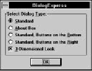
Figure 7-13 DialogExpress dialog box
DialogExpress gives you several options for simple dialog boxes that you may use as a starting point for your own dialog box. Select Standard and click OK. The Dialog editor opens in the right pane of the Browser window (Figure 7-14).
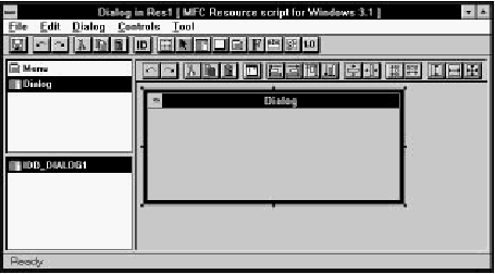
Figure 7-14 Dialog editor open in Browser window
At the same time, the Dialog editor toolbox (Figure 7-15) opens. This toolbox provides shortcuts to commands in the Tool menu that let you create the different types of dialog box control.
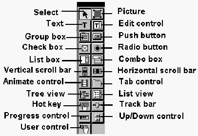
Figure 7-15 Dialog editor toolbox
The Property Sheet shows the General, Styles, and Look properties of the dialog box (Figure 7-16). You may want to start by changing the dialog box title.
Type the new title into the Text field of the General properties page.
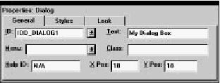
Figure 7-16 Properties of a dialog resource
Adding a push button
Initially, a new Standard dialog has no controls. To create a new push button:- Choose Push Button from the Tool menu or click on the corresponding icon in the toolbox.
- Click in the dialog box on the point at which you want to position the upper-left corner of the new button. Hold down the left mouse button and drag the cursor. A rubber-band rectangle appears.
- Release the left mouse button when the rectangle is the proper size for the new button. A new push button is placed in your dialog box (Figure 7-17).
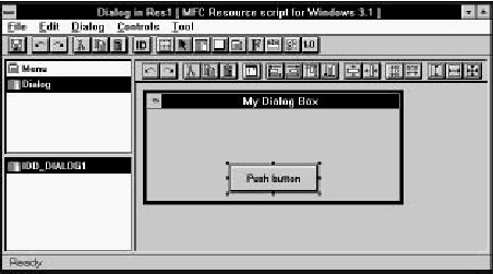
Figure 7-17 Dialog box resource with new push button
The new push button is selected and highlighted. Then move and resize the new push button control with the mouse.
- To move a control, click and drag it to a new location.
- To resize a control, click and drag one of the eight "handles" that appear along its edges.
The Property Sheet lets you modify push button properties (Figure 7-18). To change the button text, for example, change the Text field to the desired text. As with items in menus, you can set the activation key of a button or other control by typing an ampersand (&) before the corresponding letter in the text.
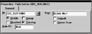
Figure 7-18 Properties of a push button control
Adding static text
To add static text to a dialog box (for example, an informational message), choose Text from the Tool menu or click on the corresponding icon in the toolbox. Then click in your dialog box and drag the rubber-band box to the desired size.The Property Sheet shows the properties of the static text (Figure 7-19). To change the text, edit the Text field. After entering the text, you can resize the static control to the size of the text by dragging the handles.
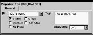
Figure 7-19 Properties of a static text control
To center the text within the control, select Center from the drop-down list in the Align/ Style property. Center the control within the dialog box by choosing Horizontal from the Center submenu of the Controls menu.
A static text control may contain multiple lines of text. While typing text into the Caption field, press Ctrl+Enter to start a new line. Likewise, insert tab characters by pressing Ctrl+Tab.
Testing the dialog box
Test the dialog box resource without leaving ResourceStudio. To open the new dialog box for testing, choose Test Dialog from the Dialog menu (Figure 7-20).
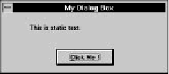
Figure 7-20 Testing the new dialog box
When you are testing the dialog box, ResourceStudio does not function; you must close the test dialog box by pressing Alt+F4 before continuing.
Aligning controls
Commands are available to align controls, to space them evenly, and to make them the same size. The following steps illustrate the three operations:- Add a few odd-sized buttons to your dialog box, using the procedure described in the section "Adding a push button" earlier in this chapter. Place them in a horizontal row.
- Select all the buttons at once by clicking on one, then holding down either the Shift or Control key as you click on the others. You can also choose Select from the Tool menu and drag a rubber-band box around the controls.
- Establish one button as the "standard." Hold down Control and click on this button. The standard button is highlighted in blue on your screen. Figure 7-21 shows what your dialog box might look like. In the example, the button labeled "# 2" has been selected as the standard.

Figure 7-21 Multiple selection of controls
Now you can perform any of the following alignment operations from the Controls menu:
- To make all the buttons the same size as the standard, choose Both from the Make Same Size submenu.
- To align the tops of the buttons with the top of the standard, choose Top from the Align submenu.
- To even out the horizontal spacing between the buttons, choose Horizontal from the Space Evenly submenu.
Closing the dialog box editor
After finishing with a dialog box, close the Dialog editor by choosing Close Editing from the File menu. The Browser window is updated to show the new resource (Figure 7-22).
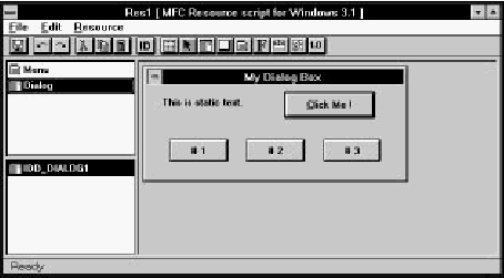
Figure 7-22 Browser window after creating dialog box resource
After creating a dialog box resource, you can use ClassExpress to create a corresponding dialog box class, set up the class's message map, and implement dynamic data exchange and validation. ClassExpress can be run directly from the Browser window's File menu. For further information, see Chapter 18, More about ClassExpress, as well as Chapter 13, Lesson 4: Add Messages with ClassExpress and Chapter 14, Lesson 5: Add a Dialog Box with ClassExpress.
Creating a new bitmap resource
A bitmap is a picture that may be used for informational or decorative purposes. The Bitmap editor contains the functionality of a typical paint program, allowing you to create pictures of any size in 2, 16, or 256 colors.To create a new bitmap resource, choose New Bitmap from the Resource menu of the Browser window. The BitmapExpress dialog box opens (Figure 7-23).
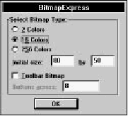
Figure 7-23 BitmapExpress dialog box
BitmapExpress allows you to set the number of colors and the initial size of the bitmap. If you are creating a bitmap for an MFC toolbar, you also can specify the number of buttons. For now, accept the defaults and click OK. The Bitmap editor opens in the right-most pane of the Browser window (Figure 7-24).
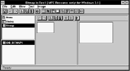
Figure 7-24 Bitmap editor open in Browser window
The Bitmap editor window is divided into two panes. Draw in either. To change the relative sizes of the panes, click and drag the bar separating the panes.
The Bitmap editor toolbox (Figure 7-25) also opens. This toolbox lets you choose graphics tools (also available in the Tool menu), set foreground and background colors, and select the line width and background pattern.
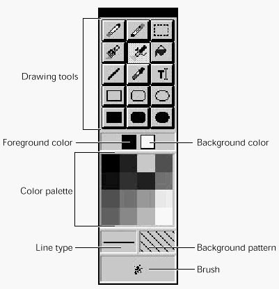
Figure 7-25 Bitmap editor toolbox
The Property Sheet shows the General and Palette properties of the bitmap (Figure 7-26). Page between the two groups of properties by clicking on the tabs. The File field specifies the bitmap file; bitmaps are included in resource scripts by reference. If you want to change the bitmap file's name, type a new name into the File textbox.
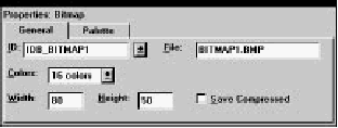
Figure 7-26 Properties of a bitmap resource
Changing bitmap size
To change the bitmap size, change the width and height in the Property Sheet or resize the bitmap directly by dragging one of the handles along the right and bottom edges of the bitmap.Selecting colors and patterns
Select drawing color and patterns from the toolbox in the following way:- Foreground color: Click on the color in the color palette with the left mouse button.
- Background color: Click on the color in the color palette with the right mouse button.
- Line type: Click in the line type display and select a line type from the pop-up menu.
- Background pattern: Click in the background pattern display and select a pattern from the pop-up menu.
- Brush: Click in the brush display and select a paintbrush or spray brush from the pop-up menu. The menu is only available when the Paintbrush or Spray brush tool is selected; it is also available by right-clicking on these tools.
Drawing tools
These drawing tools are available in the toolbox or in the Tool menu:- Eraser: Removes all or part of the image
- Pen: Draws individual pixels or freehand lines
- Selection tool: Selects a rectangle that may be cut, copied, flipped, or inverted
- Brush: Paints freehand lines with the selected brush
- Spray brush: Paints patterns of pixels
- Paint can: Floods an area with color
- Line: Draws straight lines
- Eye-dropper: Picks up a color from the image
- Rectangles and ovals: Draw outlines or solid shapes
Zoom and grid
Work with an image at normal size or zoom by factors of 2, 4, or 8. To zoom, click in the pane containing the image, then select a Zoom command from the View menu. Set one image at normal size for reference and a second image at a larger size for easier drawing.To help finish the details of the image, you can display a pixel grid in the image. A pixel grid can be displayed only when the zoom factor is 4 or 8. To show a pixel grid, choose Grid from the View menu.
Closing the bitmap editor
After finishing with the bitmap, close the Bitmap editor by choosing Close Editing from the File menu. The Browser window is updated to show the new resource (Figure 7-27).
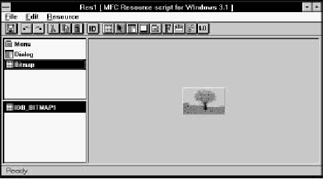
Figure 7-27 Browser window
Useful ResourceStudio features
A number of ResourceStudio features are useful for creating and editing different resources. These include toolbars, the undo and redo functions, and the dragging and dropping of items.Toolbars and pop-up menus
ResourceStudio makes extensive use of toolbars. Toolbar icons offer quick access to frequently used menu items. For a list of toolbar commands, see the "ResourceStudio Reference."In many parts of ResourceStudio, clicking with the right mouse button opens a pop-up menu. The contents of the menu depend on the item clicked and on the current mode or tool. Pop-up menus are a convenient way to access commands available from the main menu.
Undo and redo
ResourceStudio can undo any operation or redo any operation that was undone. To undo the previous operation, choose Undo from the Edit menu or click on the Undo icon in the toolbar. Notice that the operation that will be undone is noted within the Undo menu item. To instead redo an action that was just undone, choose Redo from the Edit menu.Operations that you have performed are saved in lists. To set the number of operations that are saved (and thus that can be undone or redone), choose Preferences from the Shell window's Edit menu. Each Browser window and each resource type's editor keeps its own undo and redo list.
To view a list of stored operations, click the right mouse button on the Undo or Redo toolbar icon. Select one or more operations from the list (see Figure 7-28).
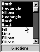
Figure 7-28 List of stored operations in Bitmap editor
Clipboard and drag and drop
ResourceStudio supports cut, copy, and paste of resources and of objects within resources, such as dialog box controls and menu items.ResourceStudio also supports drag and drop of all items that can be cut, copied, and pasted. To move a resource or resource element, click and drag it to the new location. For example, to move resources from one file to another, open a Browser window for each file, then drag the resources from the first file to the second. To copy rather than move the element, hold down the Control key until you have released the item.
Managing Resource IDs
Windows programs identify resources by a resource name, which can be a string or a number. Windows programs also use numbers to identify commands resulting from menu selections and accelerators and to identify dialog box controls. The number of identifiers used in a single application easily can run into the hundreds. One of the major features of ResourceStudio is its ability to automatically create and manage resource IDs.Resource ID field
Many property pages contain an ID field for the current resource or resource element. There are three types of resource IDs in ResourceStudio:- Textual
- Symbolic
- Numeric
Textual IDs
Textual IDs are allowed only for certain resource types. To specify a textual ID, enclose the text in the ID field in double quotes. ResourceStudio warns you if you try to assign a textual ID to a resource type for which it is not allowed.Symbolic IDs
Symbolic IDs are names that correspond to numbers. By using this type of ID, you work with names that are meaningful, leaving ResourceStudio to keep track of the numbers that match the names. Symbols and their corresponding numbers are saved in the resource header file as #define statements. Thus the same symbols can be used to refer to the resources in your application code.Assign a symbolic ID either by typing the name into the ID field or by selecting a pre-existing ID from the drop-down list. If you enter a new symbol, ResourceStudio automatically assigns a unique numeric value. If you want to specify the numeric value, follow the symbolic name with an equal sign and the value (for example, IDD_ TEST= 451). Reassign the value of an existing symbol in the same way.
Numeric IDs
Numeric IDs should not be used in new resource script (.rc) files; use symbolic IDs instead. If you create a binary resource file (.res), or edit the resources in an existing .exe or .dll file, you see the resource IDs as numbers, because the symbolic information is not saved for these file types. Assign a numeric ID by typing the number into the ID field.Note: When editing resources in .exe or .dll files, remember that the compiled source code refers to resources and commands by the numeric (or textual) ID; reassigning or changing IDs may result in incorrect behavior.
Automatic creation of resource IDs
ResourceStudio automatically creates a new resource ID every time one is needed. The new ID is unique within its context: for resource elements, the ID is unique within the resource and, for resources, unique within the resource file.When assigning values to new symbols typed in by the user or created automatically, ResourceStudio uses different ranges for various purposes:
- Resource item range (100-1999)
- Used for resources within a resource file
- User range (2000-2999)
- Used for resource IDs created by the user from within the Resource ID Browser dialog box (see below)
- Control range (3000-31999)
- Used by the Dialog editor for dialog controls
- Command range (32000-65535)
- Used by menu and accelerator editors for menu commands
Resource ID browsing
To browse and modify resource IDs, choose Edit Resource IDs from the File menu.The Resource ID Browser dialog box opens (Figure 7-29).
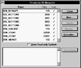
Figure 7-29 Resource ID Browser dialog box
The upper listbox shows all the symbolic resource IDs in the resource file. Symbols can be sorted by name, value, or used/ unused state. Click on an ID to show a list of resources using the ID in the lower listbox. Open a resource shown in the lower listbox by double-clicking on it, or by selecting it and clicking View Usage.
The remaining buttons are:
- New
- Opens the New Resource ID dialog box. Here you can create a new symbol and assign a value. By default, the value is in the User range (2000-2999).
- Delete
- Deletes the currently selected symbol. A symbol may only be deleted if it is not in use.
- Change
- Opens the Change Resource ID dialog box. Here you can change the symbol name or value.
- Renumber
- Performs a renumbering operation on all symbolic IDs. Each symbol is examined and a new value is assigned based on how it is used. If a symbol is used by items whose values are usually in different ranges, a dialog box asks for the range in which to place the value.