


26. Dialog Editor
This ResourceStudio reference chapter contains details about the commands and options found in the Dialog editor. For an introduction to ResourceStudio, see Chapter 7, "Adding Look and Feel with Resources."Dialog Editor
The Dialog editor (see Figure 26-1) is used to edit dialog resources.
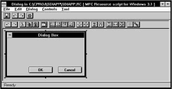
[Figure 26-1 The Dialog editor
The Dialog editor displays the dialog box and its controls as they will appear at run time. To add a new control to the dialog box, select a tool from the Tool menu (or from the toolbox), then place the control in the dialog box by clicking and dragging. Controls can be moved and resized by clicking and dragging as well. Commands in the Controls menu can be used to center and align controls. The dialog box can be tested by choosing Test Dialog in the Dialog menu. For more information about using the Dialog editor, see Chapter 7, "Adding Look and Feel with Resources."
DialogExpress
As a new dialog resource is created, the DialogExpress dialog box opens (see Figure 26-2). DialogExpress lets you select a predefined dialog box type to use as a starting point for your dialog resource.
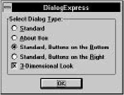
[Figure 26-2 DialogExpress
Select dialog type
Specifies a type of dialog box to create as a starting point for the dialog resource.- Standard:
- Creates a dialog box with no controls.
- About box:
- Creates a dialog box with static text and an OK button.
- Standard, buttons on the bottom:
- Creates a dialog box with OK and Cancel buttons along the bottom.
- Standard, buttons on the right:
- Creates a dialog box with OK and Cancel buttons along the right edge.
3-dimensional look
Specifies that the dialog box and controls should look 3-dimensional.File menu commands
The File menu (see Figure 26-3) contains commands to save the resource file, edit resource IDs, and perform other miscellaneous functions.
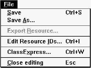
[Figure 26-3 Dialog editor File menu
Save
Saves the resource file. If the file is unnamed, this command executes Save As.Save As
Opens a Windows File Save As dialog box, which is used to save the resource file under a new name.Edit Resource IDs
Opens the Resource ID Browser dialog box, used to browse and modify resource IDs. For more information about managing resource IDs and using the Resource ID Browser dialog box, see "Managing Resource IDs," in Chapter 7, "Adding Look and Feel with Resources."ClassExpress
Runs ClassExpress, passing the filename of the resource file as the project that ClassExpress should open. This command is only enabled if the Dialog editor is running in the right pane of the Browser window.Close Editing
Closes the Dialog editor.Edit menu commands
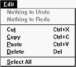
The Edit menu (see Figure 26-4) contains standard editing commands. You can undo operations, and can cut, copy, paste, and delete single or multiple controls. Note that to select multiple controls, you must press Shift or Control while clicking the second and subsequent controls, or must use the selection tool to drag a box around the controls.
[Figure 26-4 Dialog editor Edit menu
Undo
Undoes the last Dialog editor operation.Redo
Redoes the last action that was undone.Cut
Copies the selected control to the Clipboard, then deletes it from the dialog box.Copy
Copies the selected control to the Clipboard.Paste
Copies the control in the Clipboard to the dialog box.Delete
Deletes the selected control from the dialog box.Select All
Selects all controls in the dialog box.Dialog menu commands
The Dialog menu (see Figure 26-5) contains commands to control the grid, display tab stops, test the dialog, and check for duplicate control IDs.
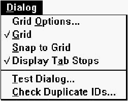
[Figure 26-5 Dialog editor Dialog menu
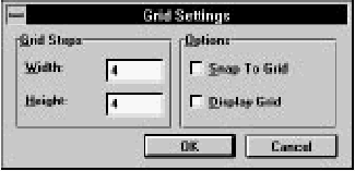
Grid Options
Opens the Grid Settings dialog box (see Figure 26-6), used to set grid options.
[Figure 26-6 Grid Settings dialog box
Width
Specifies the grid point horizontal spacing.Height
Specifies the grid point vertical spacing.Snap to grid
If checked, controls can only be moved to positions which coincide with grid points. When controls are resized, horizontal and vertical sizes are adjusted to multiples of the grid point spacings.Display grid
If checked, the grid is displayed.Grid
Toggles display of the grid.Snap to Grid
Moves the selected control to the nearest grid point.Display Tab Stops
Toggles the display of tab stop numbers on controls. Tab order can be adjusted with commands in the Tab Order submenu of the Controls menu.Test Dialog
Runs the dialog. End testing by clicking on a button with a resource ID of IDOK or IDCANCEL, or by pressing Alt+ F4.Check Duplicate IDs
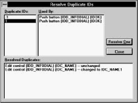
Checks the dialog for duplicate control IDs. If any two items have the same ID, the Resolve Duplicate IDs dialog box opens (see Figure 26-7).
[Figure 26-7 Resolve Duplicate IDs dialog box
To resolve duplicate IDs, first click on a number in the Duplicate IDs list. The Used By listbox displays the controls that are using that ID. Click on Resolve One to automatically assign new IDs (with unique values) to the controls.
Note that all static text usually shares the same ID; in general, this is acceptable and does not cause conflicts in the application.
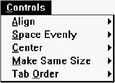
Controls menu commands
The Controls menu (see Figure 26-8) contains commands to align, space, and center controls, and to adjust tab order.
[Figure 26-8 Dialog editor Controls menu
Align
Opens the Align submenu (see Figure 26-9). Before choosing one of these commands, select two or more controls and designate one as the standard by clicking on it while pressing the Control key.
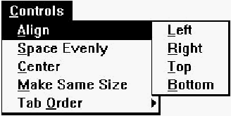
[Figure 26-9 Dialog editor Controls menu Align submenu
Left
Aligns the left edges of the selected controls with the left edge of the standard.Right
Aligns the right edges of the selected controls with the right edge of the standard.Top
Aligns the top edges of the selected controls with the top edge of the standard.Bottom
Aligns the bottom edges of the selected controls with the bottom edge of the standard.Space Evenly
Opens the Space Evenly submenu (see Figure 26-10). Before choosing one of these commands, select three or more controls.
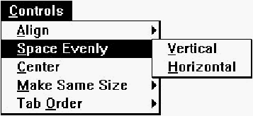
[Figure 26-10 Dialog editor Controls menu Space Evenly submenu
Vertical
Spaces the selected controls evenly in the vertical direction.Horizontal
Spaces the selected controls evenly in the horizontal direction.Center
Opens the Center submenu (see Figure 26-11). Before choosing one of these commands, select one or more controls.
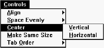
[Figure 26-11 Dialog editor Controls menu Center submenu
Vertical
Centers the selected controls vertically within the dialog box.Horizontal
Centers the selected controls horizontally within the dialog box.Make Same Size
Opens the Make Same Size submenu (see Figure 26-12). Before choosing one of these commands, select two or more controls and designate one as the standard by clicking on it while pressing the Control key.
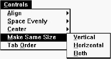
[Figure 26-12 Dialog editor Controls menu Make Same Size submenu
Vertical
Changes the vertical size of the selected controls to that of the standard.Horizontal
Changes the horizontal size of the selected controls to that of the standard.Both
Changes both the vertical and horizontal sizes of the selected controls to those of the standard.Tab Order
Opens the Tab Order submenu (see Figure 26-13). Before choosing one of these commands, select a single control.
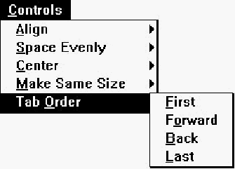
[Figure 26-13 Dialog editor Controls menu Tab Order submenu
First
Moves the selected control to the front of the tab sequence.Forward
Moves the selected control forward in the tab sequence.Back
Moves the selected control back in the tab sequence.Last
Moves the selected control to the end of the tab sequence.Tool menu commands
The Tool menu (see Figure 26-14) lets you select tools used to place controls in the dialog box. After selecting a tool, click and drag in the dialog box to place and size the new control. Once the control is placed, the Select tool is selected automatically.
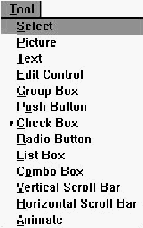
[Figure 26-14 Dialog editor Tool menu
Select
Selects the Select tool. With the Select tool, you can select individual controls. You can select groups of controls by clicking in the dialog box outside of any control and dragging a box over the controls to be selected.Picture
Selects the Picture tool, used to place a static image (a box, frame, or icon) in the dialog box.Text
Selects the Text tool, used to place static text in the dialog box.Edit Control
Selects the Edit Control tool, used to place an edit control (a textbox) in the dialog box.Group Box
Selects the Group Box tool, used to place a group box in the dialog box.Push Button
Selects the Push Button tool, used to place a push button in the dialog box.Check Box
Selects the Check Box tool, used to place a check box in the dialog box.Radio Button
Selects the Radio Button tool, used to place a radio button in the dialog box.List Box
Selects the List Box tool, used to place a listbox in the dialog box.Combo Box
Selects the Combo Box tool, used to place a combobox in the dialog box.Vertical Scroll Bar
Selects the Vertical Scroll Bar tool, used to place a vertical scroll bar in the dialog box.Horizontal Scroll Bar
Selects the Horizontal Scroll Bar tool, used to place a horizontal scroll bar in the dialog box.Toolbar commands
The Dialog editor toolbar (see Figure 26-15) provides quick access to frequently used menu commands. Left-click on these buttons, except where noted.

[Figure 26-15 Dialog editor toolbar
- Undo:
- Same as choosing Undo from the Edit menu. You can right-click on this button to undo multiple operations at once.
- Redo:
- Same as choosing Redo from the Edit menu. You can right-click on this button to redo multiple operations at once.
- Cut:
- Same as choosing Cut from the Edit menu.
- Copy:
- Same as choosing Copy from the Edit menu.
- Paste:
- Same as choosing Paste from the Edit menu.
- Test Dialog:
- Same as choosing Test Dialog from the Dialog menu.
- Align Left:
- Same as choosing Left from the Align submenu of the Controls menu.
- Align Right:
- Same as choosing Right from the Align submenu of the Controls menu.
- Align Top:
- Same as choosing Top from the Align submenu of the Controls menu.
- Align Bottom:
- Same as choosing Bottom from the Align submenu of the Controls menu.
- Center Vertical:
- Same as choosing Vertical from the Center submenu of the Controls menu.
- Center Horizontal:
- Same as choosing Horizontal from the Center submenu of the Controls menu.
- Space Evenly Vertical:
- Same as choosing Vertical from the Space Evenly submenu of the Controls menu.
- Space Evenly Horizontal:
- Same as choosing Horizontal from the Space Evenly submenu of the Controls menu.
- Same Size Vertical:
- Same as choosing Vertical from the Make Same Size submenu of the Controls menu.
- Same Size Horizontal:
- Same as choosing Horizontal from the Make Same Size submenu of the Controls menu.
- Same Size Both:
- Same as choosing Both from the Make Same Size submenu of the Controls menu.
- Grid:
- Same as choosing Grid from the Dialog menu.
- Tab Stops:
- Same as choosing Display Tab Stops from the Dialog menu.
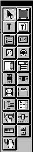
Toolbox
The Dialog editor toolbox (see Figure 26-16) provides quick access to the tools available in the Tool menu, plus tools for adding custom controls and user controls (not pictured). For more information, see "Tool menu commands," earlier in this chapter.
[Figure 26-16 Dialog editor toolbox
Dialog box properties
The dialog box has three pages of properties (four if the target platform is Windows 95). The General properties are shown in Figure 26-17.
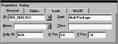
[Figure 26-17 Dialog box General properties
The Text field is used to specify the dialog box title.
Styles properties are shown in Figure 26-18.
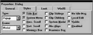
[Figure 26-18 Dialog box Styles properties
Look properties are shown in Figure 26-19.
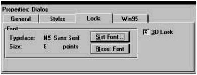
[Figure 26-19 Dialog box Look properties
The dialog box font can be set by clicking on Set Font and selecting a font from the dialog box which opens. The Reset Font button resets the dialog box font to the system default.
If the target platform is Windows 95, the dialog box has an extra page of properties, as shown in Figure 26-20.
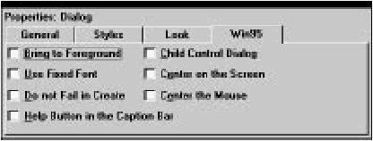
[Figure 26-20 Dialog box Win95 properties
See your Windows 95 documentation for more information.
Picture properties
Pictures (static images) have properties as shown in Figure 26-21.
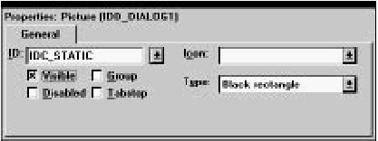
[Figure 26-21 Picture properties
Select a Type from the drop-down list. If you select Icon, you must also select an icon from the Icon drop-down list.
Text properties
Static text properties are shown in Figure 26-22.
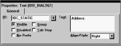
[Figure 26-22 Text properties
Type the static text into the Text textbox. Newlines can be entered by typing Ctrl+ Enter.
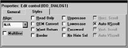
Edit control properties
Edit controls have two pages of properties. The General properties are shown in Figure 26-23.
[Figure 26-23 Edit control General properties
Edit control Styles properties are shown in Figure 26-24.
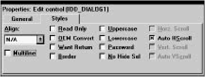
[Figure 26-24 Edit control Styles properties
Group box properties
Group box properties are shown in Figure 26-25.
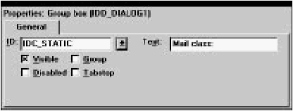
[Figure 26-25 Group box properties
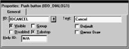
Push button properties
Push button properties are shown in Figure 26-26.
[Figure 26-26 Push button properties
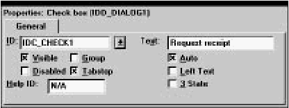
Check box properties
Check box properties are shown in Figure 26-27.
[Figure 26-27 Check box properties
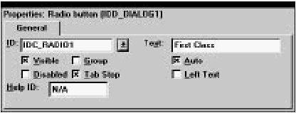
Radio button properties
Radio button properties are shown in Figure 26-28.
[Figure 26-28 Radio button properties
Listbox properties
Listboxes have two pages of properties. The General properties are shown in Figure 26-29.
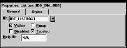
[Figure 26-29 Listbox General properties
Listbox Styles properties are shown in Figure 26-30.
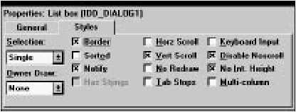
[Figure 26-30 Listbox Styles properties
Combobox properties
Comboboxes have two pages of properties. The General properties are shown in Figure 26-31.
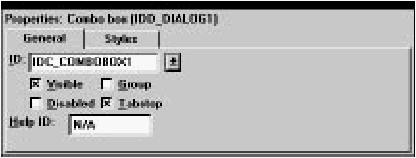
[Figure 26-31 Combobox General properties
Combobox Styles properties are shown in Figure 26-32.
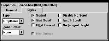
[Figure 26-32 Combobox Styles properties
Scroll bar properties
Scroll bar properties are shown in Figure 26-33.
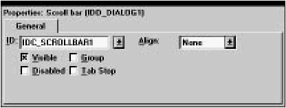
[Figure 26-33 Scroll bar properties
Custom control properties
These pages let you work with custom controls. A custom control resides in a DLL that implements the standard functions for manipulating and displaying the control. ResourceStudio can display a custom control as it will appear in your application.Custom controls have two pages of properties. The General properties are shown in Figure 26-31. Use the ID field to edit a custom control's resource ID. To change its style attributes, click Style; this displays the dialog box that the control DLL implements for that purpose.
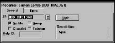
[Figure 26-34 Custom Control General properties
Custom control Extra properties are shown in Figure 26-32. You edit the initialization data for custom controls in this page.
[Figure 26-35 Custom Control Extra properties
Working with custom controls
Installed custom control DLLs provide ResourceStudio with the information it needs to display the control as it will appear in the application, and open the DLL's control-specific dialog box, with which you specify the control's attributes.To place a custom control in a dialog box:
- Install its DLL using the Add button on the Controls page of the Preferences dialog box.
- Click the button in the Toolbox that corresponds to the control, and drag it into the dialog box. Right-clicking on a custom control's button displays its name.
- Use the General property page to specify the control's resource ID and style attributes.
- Use the Extra property page to specify any initialization data for the control. At run-time, the control's window procedure receives a pointer to this data in lParam of the WM_CREATE message.
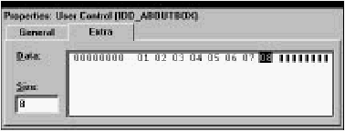
User control properties
These pages let you work with user controls. A user control is any control that either is not implemented in a DLL, or whose implementation is non-standard. ResourceStudio can only display a user control as a box. ResourceStudio treats VBX controls as user controls.User controls have two pages of properties. The General properties are shown in Figure 26-36. You use this page to edit a user control's resource ID or change its style bits.
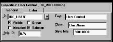
[Figure 26-36 User Control General properties
User control Extra properties are shown in Figure 26-32. You edit the initialization data for user controlsin this page.

[Figure 26-37 User Control Extra properties
Working with user controls
To place a user control in a dialog box:- Click the user control button in the Toolbox, and drag it into the dialog box.
- Use the General property page to specify the control's resource ID, style bits, and other information.
- Use the Extra property page to specify any initialization data for the user control. At run-time, the control's window procedure receives a pointer to this data in lParam of the WM_CREATE message.
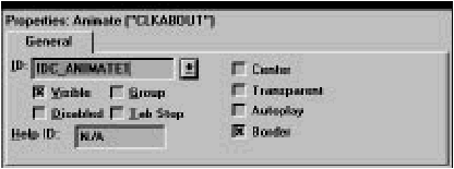
Animate control properties
Animate control properties are shown in Figure 26-38.
[Figure 26-38 Animate control properties
Tree view properties
Tree view properties are shown in Figure 26-39.
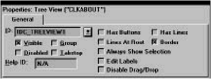
[Figure 26-39 Tree View properties
Tab control properties
Tab controls have two pages of properties. The General properties are shown in Figure 26-40.
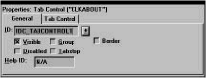
[Figure 26-40 Tab Control General properties
Tab Control properties are shown in Figure 26-41.
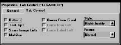
[Figure 26-41 Tab Control properties
List view control properties
List view controls have three pages of properties. The General properties are shown in Figure 26-42.
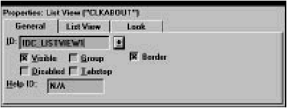
[Figure 26-42 List View Control General properties
List View properties are shown in Figure 26-43.
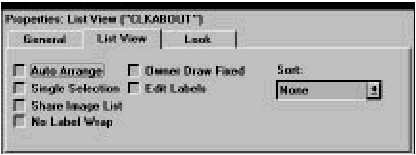
[Figure 26-43 List View properties
Look properties are shown in Figure 26-44.
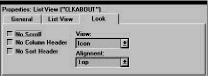
[Figure 26-44 List View Look properties
Hotkey properties
Hotkey properties are shown in Figure 26-45.
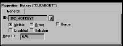
[Figure 26-45 Hotkey properties
Track Bar properties
Track bars have two pages of properties. The General properties are shown in Figure 26-46.
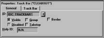
[Figure 26-46 Track Bar General properties
Track Bar properties are shown in Figure 26-47.
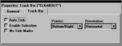
[Figure 26-47 Track Bar properties
Progress control properties
Progress control properties are shown in Figure 26-48.
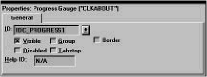
[Figure 26-48 Progress control properties
Up/Down control properties
Up/Down controls have two pages of properties. The General properties are shown in Figure 26-49.
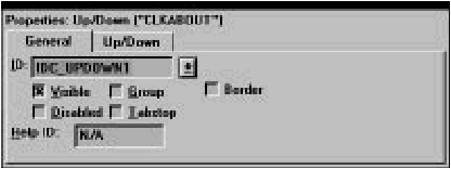
[Figure 26-49 Up/Down control General properties
Up/Down properties are shown in Figure 26-50.
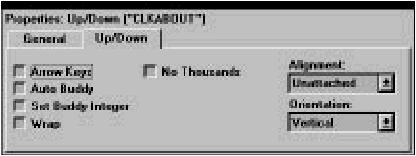
[Figure 26-50 Up/Down properties